教你如何自定义圆角炫彩滚动公告栏样式,打造独特视觉效果。
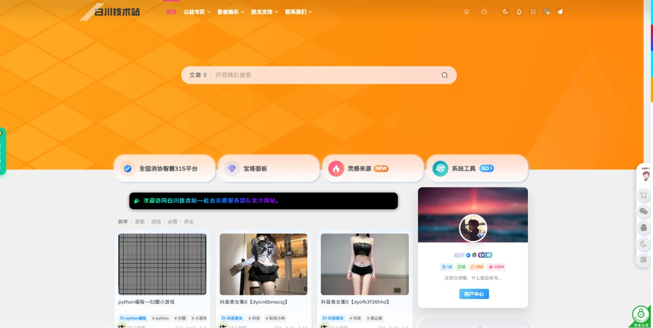
圆角设置选项
- 轻微圆角:border-radius: 6px;
- 标准圆角:border-radius: 12px;(推荐设置)
- 大圆角(胶囊形):border-radius: 24px; 或 border-radius: 50px;
专业建议
提示:如需左右两侧呈现半圆形(胶囊效果),建议设置 border-radius: 50px; 并确保元素高度固定。
样式特点
默认采用黑色背景搭配炫彩文字效果,滚动展示公告内容。
<!DOCTYPE html>
<html lang="zh-CN">
<head>
  <meta charset="UTF-8" />
  <meta name="viewport" content="width=device-width, initial-scale=1.0"/>
  <title>圆角炫彩滚动公告</title>
  <style>
    body {
      background: #f0f0f0;
      padding: 20px;
      margin: 0;
    }

    .rainbow-notice {
      background: #000;
      padding: 12px 0;
      border-radius: 12px;
      box-shadow: 0 2px 10px rgba(0,0,0,0.5);
      overflow: hidden;
      white-space: nowrap;
      font-family: "Microsoft YaHei", sans-serif;
      margin: 10px auto;
      max-width: 90%;
    }

    .notice-content {
      display: inline-block;
      padding-left: 100%;
      animation: scroll-left 20s linear infinite;
    }

    .rainbow-text {
      background: linear-gradient(to right,
        #ff0000, #ff8000, #ffff00, #80ff00,
        #00ff80, #00ffff, #0080ff, #8000ff,
        #ff00ff, #ff0080, #ff0000);
      background-size: 300% 100%;
      -webkit-background-clip: text;
      background-clip: text;
      color: transparent;
      animation: rainbow 4s linear infinite;
      font: bold 16px/1 "Microsoft YaHei", sans-serif;
      letter-spacing: 1px;
    }

    @keyframes scroll-left {
      to { transform: translateX(-100%); }
    }

    @keyframes rainbow {
      to { background-position: 300% 50%; }
    }

    @media (max-width: 768px) {
      .rainbow-notice {
        border-radius: 8px;
        padding: 10px 0;
      }
      .rainbow-text {
        font-size: 14px;
      }
    }
  </style>
</head>
<body>
  <div class="rainbow-notice">
    <div class="notice-content">
      <span class="rainbow-text">🎉 欢迎访问小妖精工具箱</span>
    </div>
  </div>
</body>
</html>